
The Best German Book Design 2021
These outstanding examples of design, concept and finishing are selected for the award by an independent jury.
Single title
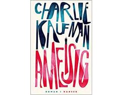
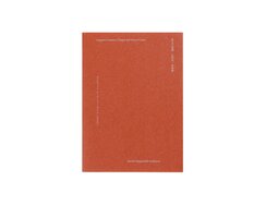
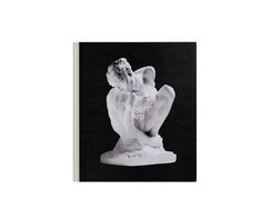
Endbands generally come as a matching pair, but not here. Instead, they diverge in eye-catching fashion, the headband being in...
Endbands generally come as a matching pair, but not here. Instead, they diverge in eye-catching fashion, the headband being in fuchsia red and the tailband in azure blue. What’s more, each contrasts individually with the adjacent page edges, thanks to a complex gradation that runs right around the book block. The top edge thus features a bright blue that gradually deepens, turning dark blue on the foredge and then morphing into a strawberry red by the time you reach the blue tailband at the bottom, where a blue marker ribbon invites you to open the pages at last.
Here, there’s a timeless-looking type area with a tried-and-tested roman typeface in a decent point size, resulting in ideal line lengths with minimum hyphenation and largely even spacing. New paragraphs are, of course, denoted via indents. The thin paper of the hefty 864-page block weighs just 60 gsm, giving it the air of a membrane through which the story filters. The latter, reduced to a single sentence, goes as follows: a film critic discovers the world’s longest movie, then learns of its destruction and subsequently attempts to reconstruct it from the depths of his own mind.
But back to the design: the freeform curves of author name and book title call to mind the psychedelic iconography of the 1970s, while reflections glint from the distended letters, thanks to a partial gloss coating that leaves the surrounding open-pored paper matt white. With such an attention-grabbing cover, it’s fair to say that no decorative jacket is required.
- Publisher:
- ISBN:
- 978-3-446-26833-3
- Author:
- Charlie Kaufman
- Pages:
- 864
- Price:
- € 34.00
This sociological survey of the situation of Basel’s women between 100 and 150 years ago is given weight by the...
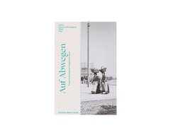
This sociological survey of the situation of Basel’s women between 100 and 150 years ago is given weight by the book’s bold form. The first thing you notice is its hybrid binding. The stitched book block is sandwiched between sheets of thin laminated card – as per a stiff soft cover – over which white bookcloth is glued in the manner of a half-cloth binding, thereby creating an otabind cover.
The text columns are pushed right to the outer margins and use the full height of the page, which is why the rotated line comprising page title and number is accommodated in the wide inner margin. Extra-large indents, meanwhile, add a square of white space to the first three lines of every new section – as if for a drop cap that isn’t there.
Series of historical photographs introduce each chapter. These picture spreads not only boast an atmospheric feel, they are also particularly notable for their arrangement, juxtaposing washerwomen and an operating theatre for instance.
The typography, meanwhile, offers an interesting tension between the body matter’s lyrical serif type and the even more delicate typeface of the chapter headings. Short indented text blocks, distinguished by another change in typeface and a bold green hue, form a kind of intelligently interspersed glossary. An initially somewhat perplexing choice, the modern-looking green is, in fact, a subtle signal that the issues explored here are not ancient history, they are still relevant today.
- Publisher:
- ISBN:
- 978-3-85616-944-2
- Author:
- Maja Adler, Sophie Bürgi, Eleonora Heim
- Pages:
- 128
- Format:
- 14 x 21 cm
- Price:
- € 28.00
In the 1920s, Moscow’s Vkhutemas art school was the centre of constructivist-influenced education, a place where monumental architectural and spatial...
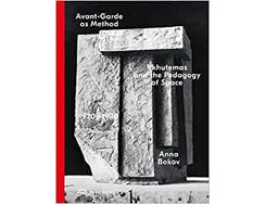
In the 1920s, Moscow’s Vkhutemas art school was the centre of constructivist-influenced education, a place where monumental architectural and spatial visions were born.
This 624-page tome provides detailed insights into the school’s pedagogical approach. Its paper is just thick enough to cope with the lavishly illustrated content while still allowing the pages to turn smoothly. The book block’s heft is counterbalanced by sturdy cover boards. The front is clad in printed bookcloth, while the back derives its tactility from the relief created by the imprinting of bold black letters on red paper – a hybrid cover that might be described as a partial inverted half-binding.
The essays are printed on the left-hand pages. Picture pages feature black backgrounds that extend up to the edge of the page, a frequency-modulated screen ensuring all images are presented in facsimile quality, while dividers printed in warm red on both sides catch the eye when flicking through the book, making it easy to navigate to each chapter.
Constructivist logic defines the typographic rules of play. A case in point: all indents, column spacings and distances from images are equal and take their cue from an insignificant detail: the captions whose hanging indents echo the 10 mm length of the preceding course codes.
Far from being retro, then, this book’s design merely tests the validity of established principles.
- Publisher:
- ISBN:
- 978-3-03860-134-0
- Author:
- Anna Bokov
- Illustrator:
- Diego Bontognali, Valeria Bonin
- Pages:
- 624
- Price:
- € 58.00
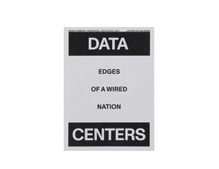
Sometimes it can be hard to separate metaphor from literal meaning. After all, today’s real-time communication and immediate dissemination has...
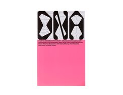
Sometimes it can be hard to separate metaphor from literal meaning. After all, today’s real-time communication and immediate dissemination has led to an “explosion of knowledge” that “relies on the world being dismembered and divided into the tiniest of units”, as the blurb for this cross-media project puts it. Now the project has spawned a series of books (of which six have been published to date) that tellingly bears the acronymic title DNA.
The graphic design for the series is particularly striking. Roughly speaking, the volumes are perfect-bound soft covers with French-fold dust jackets. More specifically, the jackets each unfold to reveal eye-catching tableaus and feature a clever zigzag fold (the jacket is folded inwards at the top and outwards at the bottom before being wrapped around the cover) that makes it hard to determine what is outside and what inside, not least because each side bears a spine title. Either way, one side is covered with a black-and-white, typographic line drawing that calls to mind a circuit diagram – it is, in fact, the outline of a bitmapped font made up of right angles and quartered circular arcs – while the other side features graduated colour blocks. Two of the colours are visible with the jacket folded; the other two link to the next volume in the series, which, if you open up all the jackets together, forms a huge carpet of colour. In each volume, these four colours are repeated inside on glossy highlight pages. Then there are the separate English-language editions, in which the front and back covers’ colours are swapped around.
Is it one big puzzle? And if so can it be solved?
- Author:
- Detlef Diederichsen, Anselm Franke, Katrin Klingan, Daniel Neugebauer, Bernd Scherer
- Pages:
- 88
- Format:
- 15 x 23 cm
- Price:
- € 10.00
What is the cloud? Where is my data? It can’t have vanished into thin air, so it must be physically...
What is the cloud? Where is my data? It can’t have vanished into thin air, so it must be physically stored somewhere. But where? And in what kind of place? Like early modern explorers, the authors of this book set out to see for themselves. After narrowing their search area down to Switzerland, they found what they sought.
The book’s interior feels as though it’s been freed of all clutter. The clean overall look is down to the eight-column layout spread across each double page. The three right-hand columns are always given over to the relevant essay; subheads start on the far left of the first column and extend into the second; paragraph indents are the width of a column, while footnotes are neatly arranged in four columns that start on the same line – simple, clear and effective.
The airy, rough-papered text pages are interspersed with five photo essays, printed on glossy illustration paper, that allow readers to gaze upon a secret world, as though peering through the periscope of a submarine. Let’s examine three of these photos more closely. In one, we see a multi-level array of galvanised conduits, with whole bundles of cables snaking across the space like extracorporeal nerves. In the second, we find ourselves looking straight at a roughly hewn rock face flanked by building walls clad in fastidiously neat embossed stone. The third offers a confounding juxtaposition of the archaic and futuristic: to the left are polished steel cabinets connected by knots of cabling, to the right is a workbench that seems to belong more to the industrial age.
- Publisher:
- ISBN:
- 978-3-03778-645-1
- Author:
- Monika Dommann, Hannes Rickli, Max Stadler
- Pages:
- 344
- Format:
- 19 x 26 cm
- Price:
- € 35.00
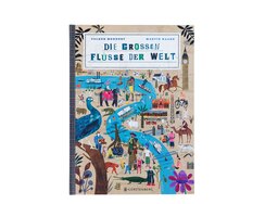
Presented in an opulent folio format, this compendium maps out major rivers such as the Danube, Mississippi, Mekong and Congo,...
Presented in an opulent folio format, this compendium maps out major rivers such as the Danube, Mississippi, Mekong and Congo, with the Nile even benefitting from fold-outs that double the page area, allowing for insights from ancient Egypt too. On each map, the blue waterway and green- or beige-hued land expanses provide the backdrop for illustrations of typical local scenes, the written descriptions of which remain literally in the background.
But what makes the overall effect so appealing? A brief analysis reveals that each composition is anchored by one or two large characters. These, like all other individual representations, are rendered as collages that call to mind the clearly defined outlines of coloured paper cut-outs. The structure of parallel curves seen in a brown bear’s wind-blown fur, for instance, recurs a few pages later in the waters of the Iguazú Falls, while each illustrated vignette is an illustrative work of art, with the same delightful attention to detail throughout.
What gives the maps such a lively feel is the fact that smaller images are scaled down – and not, as per conventional wisdom, all drawn from the start in proportion to their actual size. The effect is to create different scales within the same tableau, which, along with the tactile appeal of the cardstock, makes you want to delve right into these geographical treasure maps, to explore them with fingers as well as eyes. Indeed, it’s only when you get up close that you start taking in the captions; then their small type size suddenly makes sense, and what seemed like a hidden-picture book feels more like an adventure story.
- Publisher:
- ISBN:
- 978-3-8369-6041-0
- Author:
- Volker Mehnert, Martin Haake
- Pages:
- 40
- Format:
- 27,2 x 37 cm
- Price:
- € 25.00
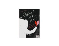
A tale of heartbreak lies herein – a confused swirl of thoughts and feelings put down in words or, when...
A tale of heartbreak lies herein – a confused swirl of thoughts and feelings put down in words or, when words don’t suffice, communicated in pictures. With both text and drawings in the author and illustrator’s own hand, the book resembles a diary of a recent romantic disappointment. As you follow the protagonist’s internal monologue, you can practically feel the words begin to assuage her inner turmoil. The text switches between cursive, block letters and block capitals (all handwritten) even within the same sentence, which, like the variation in type sizes, further emphasises the power of its silently expressed sentiments.
One particularly touching spread typifies the empathetic yet analytical nature of the book’s content: while the text explains the facts about broken-heart syndrome in everyday language, a few simple lines turn an image of a heart into an enchanting representation of heartache: fine white hairlines striating the two schematic colour blocks call to mind the fibres of the cardiac muscle, an arm hangs limply from the pale pink half, echoing the forms of the aorta, while the sad-faced red half cuddles up to its pink counterpart. It’s an image that almost makes the heartache worthwhile.
- Publisher:
- ISBN:
- 978-3-95939-097-2
- Author:
- Lucia Zamolo
- Pages:
- 128
- Format:
- 16 x 22 cm
- Price:
- € 15.00
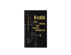
This “atlas of the petromodern age” as the book is subtitled, could itself have just been pulled from an oil...
This “atlas of the petromodern age” as the book is subtitled, could itself have just been pulled from an oil spill, its cover being drenched, bar the title, entirely in a viscous jet black. The title lettering, meanwhile, is stamped into the gloss-coated cover paper on a matt, pastel-yellow film.
Its cultural theory essays are printed in a very easy-to-read modern typeface on matt paper, while display matter uses a sans serif face featuring more contemporary detailing – the former thus nods to the machine age, the latter looks ahead to the future.
In the table of contents, individual headings run on from each other like keyword tags, hinting that this is not going to be one long story told in sequential chapters. The self-contained texts themselves are closely interlinked courtesy of numerous cross-references, the reader being invited, even encouraged, to follow the authors’ associative tangents. These interconnections are further emphasised by the way page numbers for cross-references are set in the narrow outer margins, along with additional image fragments. These bled-off picture strips form a kind of symbolic thumb index – the corresponding full-size images can be found on the cross-referenced page. Seen from its foredge, the page block thus suggests a richly illustrated picture book but, with just 43 pictures (one for each chapter) across its 324 pages, it’s more an iconographic commentary on a problematic modern fuel.
- Publisher:
- ISBN:
- 978-3-95757-942-3
- Author:
- Alexander Klose, Benjamin Steininger
- Pages:
- 324
- Format:
- 12 x 20 cm
- Price:
- € 26.00
The Holcomb Transfer Tablet from 1876, the mimeograph from 1889, the Gestetner Cyclostyle from 1900: this list of 19th-century copiers...
The Holcomb Transfer Tablet from 1876, the mimeograph from 1889, the Gestetner Cyclostyle from 1900: this list of 19th-century copiers calls to mind the kind of retrofuturism found in the contemporary pop culture genre known as steampunk.
Photocopiers are, of course, ubiquitous today. Not so the Risograph, which prints in 20 strong colours using plant oil-based ink. This volume aims to provide a new handbook for would-be risographers, though strictly speaking it’s actually two volumes. One features black-and-white illustrations and typography in a strict grid and has some of its sheets left blank. This blank section is overlaid with a gloss-paper sheet, within which nestles a second volume – a book within a book.
The aforementioned machines did genuinely exist, as the outer book relates. It also discusses the numerous technical parameters involved in exploiting the possibilities of risography to the full. Granted, users need to think backwards when preparing print data in order to manually adjust colour separations to the spot colours. A degree of anachronistic effort is therefore required, but the results can be spectacular.
The inner book provides an impressive demonstration of that fact. Via original riso prints, it takes you through the various spot colours, exploring the effects of layering. Different screen widths are tested, type samples assembled and colour charts, register marks and ink traps arranged to create complex compositions that are more akin to original graphic artworks than to mass reproductions.
- ISBN:
- 978-3-95905-304-4
- Author:
- Sven Tillack, Daniel Martin Feige, Jo Frenken
- Pages:
- 152
- Price:
- € 42.00
Small books may be commonplace, but small books whose noteworthiness is evident even from afar are a much rarer thing....
Small books may be commonplace, but small books whose noteworthiness is evident even from afar are a much rarer thing. Here, the rough cover material – raw, unbleached half-linen – offers an unexpectedly self-assured look, such bookcloth being traditionally more associated with large-format volumes. We’re reminded of old duodecimo books that fitted neatly into frock-coat pockets, particularly the kind of vade-mecum once used to freshen up jaded thoughts. The tactility of the woven fabric is heightened by the handy format, while the rounded spine and stamped black lettering further add to the appeal.
- Publisher:
- ISBN:
- 978-3-00-066035-1
- Author:
- Holm-Uwe Burgemann, Konstantin Schönfelder
- Illustrator:
- Daniel Zenker
- Pages:
- 124
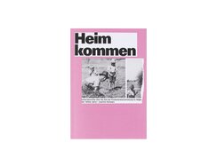
The evacuation of children from cities during the 1940s is the subject of this personal project that gathers together first-hand...
The evacuation of children from cities during the 1940s is the subject of this personal project that gathers together first-hand accounts. The resulting book features a simple glued cardboard binding and contents printed in monotone black, with the only use of spot colour being the bold-hued cover.
For all the apparent simplicity, though, there’s more here than first meets the eye. The rough paper establishes an archival atmosphere (a deliberate move) and is complemented by bold, ragged-set sans serif type that creates a neutral, resolute impression – a choice perhaps also made with older readers in mind.
The individual stories transcribed on these pages are backed up by other sources. Quotes from the media and from literature are distinguished typographically via their smaller point size, shorter line lengths and full justification as well as by being centred within the column. Images such as personal photos or old postcards are set on grey backgrounds, where dot matrixes of varying density not only provide a journalistic look but also balance out the varying quality of the original image material. Photos with fine detail and half-tones are even reproduced using a frequency-modulated screen.
The book cover bears the kind of linen weave frequently seen on textbooks, but the muted pink background colour comes as more of a surprise. It, though, can be read as a metaphor for the rosier prospects parents hoped to secure by evacuating their children in troubled times.
- Publisher:
- ISBN:
- 978-3-00-069243-7
- Author:
- Joachim Schwarz
- Pages:
- 288
- Format:
- 14,4 x 20,8 cm
- Price:
- € 19.90
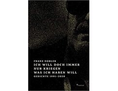
The author’s face, as grainy as the picture from a dodgy television signal, is pushed beyond the edge of the...
The author’s face, as grainy as the picture from a dodgy television signal, is pushed beyond the edge of the front cover so that the dark lens of his sunglasses resembles a giant pupil. On the opposite side, the dark-clad shoulder is bled off in similarly drastic fashion, wrapping itself around the spine to the back cover, where the schematic outline of his coat’s epaulette is reminiscent of a handle.
The interior of this poetry volume echoes the muted atmosphere of its exterior. Poems alternate with full-page photographs. Words and pictures are printed monotone in a brightened black that lends the photos a sepia-tinted air – though the intention is more melancholic than nostalgic. The photos capture incidental details so that it’s not the mysteries of life’s big issues that confound the viewer, but the ineluctability of the banal.
The choice of typeface reflects a sensitivity towards this atmosphere, featuring delicate forms with occasional capped corners and finely rounded serifs. The ragged-set verses are surrounded by pleasing white spaces whose polygon forms seem anything but random, despite – or perhaps because of – the fact that the poems themselves determine how the lines fall.
The thoughtful cover, the unpretentious arrangement of poems and photos, the unusual ink colour and smooth, slightly yellowish paper – all this suggests that a book’s design can indeed serve as an allegory for the authored work.
- Publisher:
- ISBN:
- 978-3-922895-39-8
- Author:
- Franz Dobler
- Illustrator:
- Timo Reger
- Pages:
- 287
- Price:
- € 25.00
Cleaving to a steep slope in the mountains of Hokusetsu is a newbuild structure: the chapel and visitor centre of...
Cleaving to a steep slope in the mountains of Hokusetsu is a newbuild structure: the chapel and visitor centre of a Japanese cemetery. It’s a complex whose architecture was conceived not merely as built space, but also as a dialogue with the surrounding topography, which is why landscape design plays a big part in this compact architectural monograph.
One essay bearing the title “In joy or sadness, flowers are our constant friends” talks about plantings, flowering times and symbolism. There are photographs showing the building throughout the seasons; these are printed on an ivory-white paper that is about as matt as a coated paper can be. The English and Japanese texts are set on slightly tinted paper. In oblique light, you notice its felted texture, then another surprising characteristic becomes apparent when turning the pages: its unusually bright sound.
The interspersing of picture sequences and essays gives the book block’s edges a pattern of fine stripes, while the sewn binding and open spine means it opens beautifully. On the cover, white and red microfibres enliven the earthy-red of the paper.
Japanese burials involve complex rites. The book’s design, though, goes far beyond the requisite piety, showing a reverence that makes it feel almost like a manual for meditation. There’s also a pleasing sense of new beginnings at the end: the final picture section shows the cemetery’s architecture in spring.
- Publisher:
- ISBN:
- 978-3-96098-890-8
- Author:
- Cecilia Sundström, Olivia Lawrence Bright / David Chipperfield Architects, Lodon (GB); Chinatsu Kuma, Lixil Publishing
- Pages:
- 140
- Format:
- 18 x 25 cm
- Price:
- € 29.80
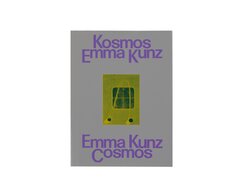
With the aid of a dowsing pendulum and graph paper, Emma Kunz created complex geometric patterns of symmetrical lines. She...
With the aid of a dowsing pendulum and graph paper, Emma Kunz created complex geometric patterns of symmetrical lines. She didn’t, though, think of herself as an artist at all – she was a healer. This new exhibition catalogue shows why she nonetheless remains a source of inspiration for contemporary art.
The three sections of the catalogue are differentiated via three types of paper: the essays are printed on yellowish book paper. Here, the two language versions – German and English – are presented in a most unusual layout. The two columns per page is as you might expect, but they are then split laterally, so that one double-page spread is transformed into what looks like eight mini book pages, with page numbers positioned so that they belong to a whole set of columns. The result is intriguing, like reading a small paperback but in a large picture-book format.
The works, which Emma Kunz created from 1938 on, are reproduced via a fine frequency-modulated screen on glossy illustration paper. One third of the picture section is given over to these otherworldly pendulum drawings, renderings perhaps of spaces beyond the physically measurable realm.
Similarly strange are the panoramas of the exhibition installation, presented on matt-finish ribbed paper. These are photographically precise, yet transcend the boundaries of what can be seen with the naked eye, with 3D scanning technology used to create an ethereal transparency that echoes what Kunz herself might have experienced.
- Publisher:
- ISBN:
- 978-3-85881-682-5
- Author:
- Elise Lammer, Lars Bang Larsen, Julia Voss u.a.
- Pages:
- 248
- Format:
- 24,5 x 32,5 cm
- Price:
- € 48.00
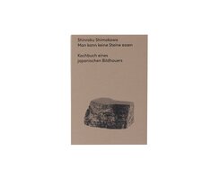
Enchanting photographs, velvety paper, clear typography, attractive spine – these are the key ingredients of this recipe book. ...
Enchanting photographs, velvety paper, clear typography, attractive spine – these are the key ingredients of this recipe book.
The robust texture of the cover’s earthy brown cardstock provides a fitting link between physical feel and subject matter, the author being a Japanese sculptor who expresses his sculptural aesthetic both in stone and in food. His recipes are arranged according to season, echoing the varying weather conditions in which the artist works on his large blocks.
The chosen materials and printing technique demonstrate that images can, in some cases, look far more striking on matt uncoated paper than on coated illustration paper. Here, the meticulously composed photographs benefit from the use of a fine frequency-modulated screen, resulting in reproductions with fascinating detail (even in three-quarter tones), increased colour range and unparalleled brilliance.
The typeface is a soft, harmonious san serif with geometric bowls, and there’s never more than one type size per page. The recipes and accompanying texts sit matter-of-factly in their respective positions, with blank lines – breathing spaces, you might call them – providing the only structuring element.
The untaped Swiss binding means the glued spine and its thread stitching is left exposed, allowing the book to open with absolute ease.
Spectacular in its simplicity, this cookbook.
- Publisher:
- ISBN:
- 978-3-9821198-4-7
- Author:
- Shinroku Shimokawa
- Pages:
- 240
- Format:
- 15 x 21 cm
- Price:
- € 32.00

Large-scale immigration has shaped the city of Marseille. This compact paperback explores the urbanistic causes for the uneasy coexistence between...
Large-scale immigration has shaped the city of Marseille. This compact paperback explores the urbanistic causes for the uneasy coexistence between natives and migrants – while also pointing the way towards a more inclusive urban planning. It’s a handbook whose sober and pragmatic approach is matched by a similarly sober and pragmatic design.
Thin pages bound by dispersion glue make it easy to handle, with the book falling open almost by itself, while precisely delineated isometric drawings offer overviews of the city’s sprawling housing projects. Here, one is reminded of the rigour of Le Corbusier’s vision of open spaces in dense cities, and of the way social realities have given such idealistic plans a very different face. The aesthetic of those realities is documented via uncommented street photography, the analytical texts being backed up by images from on-the-ground explorations.
A similarly unflinching approach can be seen in the typography. Almost unbelievably for a printed book, headings are in upper case Arial, a secretarial font the use of which requires both conviction and a feel for the subject matter. Further evidence of both can be seen in the typeface for the body matter: here the designers chose Life, a suitably lively derivative of the evergreen Times.
Also: the book has a distinct print-room smell!
- Publisher:
- ISBN:
- 978-3-944074-33-7
- Author:
- Marc Angélil, Charlotte Malterre-Barthes, Julian Schubet, Elena Schütz, Leonard Streich
- Illustrator:
- Something Fantastic Art Department, Berlin; Fernanda Tellez Velasco
- Pages:
- 282
- Price:
- € 28.00
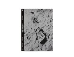
Even 52 years on, the first lunar landing still has the power to take the breath away. The astronauts themselves...
Even 52 years on, the first lunar landing still has the power to take the breath away. The astronauts themselves documented their journey to and time on the moon using a Hasselblad camera. This book is a record of that record, as it were.
It’s a documentation in two parts. The first is on bright white paper – the second on light-swallowing black. Most of the pictures in the first section are nuanced black-and white photos. Here, we marvel at fully kitted-up astronauts surrounded by engineers in suit and tie – they look like actors in a dress rehearsal. The many sequential image series, meanwhile, resemble sequences from films. At this point, the mission is still just a vision, which makes the images seem all the surreal – especially in the additional colour photos.
We then marvel even more at the second section’s pages, which are made of mill-dyed black paper and present the photos the astronauts themselves brought back to Earth. The designers’ idea of using silver instead of white against the black, meanwhile, gives the positive-negative composition of the black-and-white photos a striking twist.
The images convey the astronauts’ unique experiences – the inertia, the silence, the vastness of space – in captivating fashion. The coverage of the silver is so extensive that, at times, the surface of the paper resembles sand-blasted aluminium. Somehow these altered photos look more real than the real ones.
- ISBN:
- 978-3-95905-316-7
- Author:
- Steffen Knöll
- Pages:
- 224
- Format:
- 23 x 31 cm
- Price:
- € 36.00
This exhibition catalogue accompanies a double exhibition in which sculptures by Auguste Rodin and Hans Arp were shown together side...
This exhibition catalogue accompanies a double exhibition in which sculptures by Auguste Rodin and Hans Arp were shown together side by side.
The works are presented in sensitively lit, large-format photographs. Individual sculptures are meticulously isolated, and the works are not only cleverly shot but also beautifully printed on matt cardstock. They either loom out of deep-black backgrounds that seem to have not only swallowed the four print colours but all the light too, or they hover against overexposed backdrops, though fine-mesh printing gives the latter a slightly veiled appearance that lends real sparkle to the pieces’ light spots. Mostly, works are shown side by side on these black or white spreads, like stereoscopic images that might be overlaid in the mind’s eye.
Page numbers are printed in highly unusual positions. Some are placed centrally under single pieces, but far more innovative are the pages featuring two, three or four views of the same sculpture grouped together; here, the page number is pushed right into the middle of the page – and printed in bold red at that – thus confounding readers’ expectations. It’s as though they’ve taken on a life of their own, and yet they by no means feel out of place. Instead, the numbers form an anchor around which the different views seem to pivot or rotate.
This is a book whose singular design allows the viewer to not just compare the individual works of the two sculptors, but also trace the kinship between the two.
- Publisher:
- ISBN:
- 978-3-7757-4874-2
- Author:
- Raphaël Bouvier
- Pages:
- 200
- Format:
- 27,4 x 31 cm
- Price:
- € 58.00
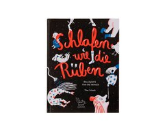
At the end of a full day, kids are often too wired to settle down to sleep – but also...
At the end of a full day, kids are often too wired to settle down to sleep – but also too tired to carry on playing – while their parents are still too preoccupied with the day’s events. That’s more or less the starting point for this book, which introduces us to one family’s eccentric bedtime ritual.
From the outset, we’re plunged into a world of chaos as we whizz through surreal verse-dotted scenes featuring monsters, mooning and a donkey called Olga. The lively illustrations on the three-colour spreads are underpinned by strong contrasts – between light and dark, white space and coloured planes, or black and cool blue plus fiery red.
But wait: our young protagonist, lying on her stomach and balancing the family dog on her upturned feet (while it sleeps peacefully on its back), pauses a moment and pensively rolls her eyes: the ritual has gone awry; she’ll just have to start again. This time, the verses rhyme and the bouncing, tickling and sock-oiling (!) all take place in the correct order.
In a clever pedagogical twist, the third stage of de-escalation features similarly turbulent visuals but accompanied by rhymes that make progressively less sense as the child starts to tire.
- Publisher:
- ISBN:
- 978-3-948722-04-3
- Author:
- Finn-Ole Heinrich, Dita Zipfel
- Pages:
- 32
- Format:
- 19,6 x 26 cm
- Price:
- € 15.00
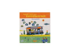
Those who haven’t yet mastered their numbers can perhaps count themselves lucky – it means they get to learn using...
Those who haven’t yet mastered their numbers can perhaps count themselves lucky – it means they get to learn using this delightful teaching aid.
A yellow road with a broken white centre line shows the way, leading us through a green landscape which unfolds into a spectacular, six-metre-long concertina made of highly fibrous matt-finish cardstock. On twenty eventful double pages, the reader is invited to find the numbers 0 to 9 plus various items in the corresponding quantity. The aesthetic recalls that of a multicolour linocut, with slightly offset forms that create an appealing overprinting at the edges of objects. With their graphically harmonious interplay between generous spaces and intricate details, the engaging compositions inspire the reader’s inner collector, with some characters – owl, cow, mole – recurring throughout as a kind of running gag.
Take the section on number 5, where the road gets particularly twisty: here we find 5 clouds, 5 mountains, 5 geese, 5 flowers, 5 snails, 5 molehills and moles, 5 parasols, 5 houses, 5 trees, 5 firework stars, 5 spots and 5 teats on a cow, 5 cabins on a big wheel, 5 visitors to a viewing tower, 5 wheels on a car, 5 unsteadily stacked lemonade jugs, 5 fingers on a hand, 5 candles on a cake, 5 balloons, 5 twirling women – and 25 number 5s. Oh, and one we almost missed: 5 loops in the road.
Front matter and appendix are printed in a typeface that could hardly be more fitting for this playful book: its name is Kartoffel pro, which is German for “potato pro”.
- Publisher:
- ISBN:
- 978-3-949086-00-7
- Author:
- Tom Eigenhufe
- Pages:
- 24
- Format:
- 23 x 23 cm
- Price:
- € 35.00