
The Best German Book Design 2023
stiftung buchkunst awards the best german book design of a year, offers a platform for rethinking the medium of the book with the sponsorship prize for young book design, and networks international book design competitions under the umbrella of best book design from all over the world.
Single title
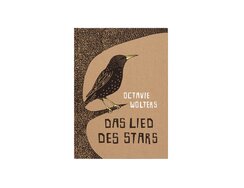
On his flights over the countryside, a starling decides to sing a song about all the beautiful things he encounters...
On his flights over the countryside, a starling decides to sing a song about all the beautiful things he encounters on his travels. He thus visits his bird neighbours one by one, dropping in on the woodpecker, owl, kingfisher, robin, swallow, duck and peacock (as well as his fellow starlings) and gaining useful pointers as to what his song should be about.
Brown-coloured bookcloth reminiscent of packing paper enfolds the coverboards, resulting in a robust hardcover binding, while the techniques and spatial composition of the cover art anticipate the aesthetic inside. Here, the illustrator and author Octavie Wolters uses double-page spreads to create generous, landscape-format images in black and white. Naturally, she also makes tactical use of the gutter, which not only acts as a hinge during page-turning but also allows the visuals to curve outwards towards the viewer. This works particularly well here thanks to the use of linocut, which, with its precisely differentiated forms, makes for wonderful graphic compositions. The resulting images are entirely in black and white, save only for our singing starling’s yellow beaks and legs.
The positive/negative nature of lino printing is particularly intriguing given that the artist has to think negatively, cutting into the linoleum the areas that are to remain white. In this case, the gouge for carving out the drawing seems to have been wielded almost as lightly as a pencil – as if the material had put up virtually no resistance.
- Publisher:
- Topic:
- Children’s/young adult book
- ISBN:
- 978-3-7725-3117-0
- Author:
- Octavie Wolters, Übersetzerin, Eva Scheikart
- Pages:
- 32
- Format:
- 23,8 x 33,5 cm
- Price:
- € 20.00

On 9 October 2019, a homicidal far-right terrorist tried to force his way into the local synagogue in Halle, where...
On 9 October 2019, a homicidal far-right terrorist tried to force his way into the local synagogue in Halle, where the Jewish community had gathered to celebrate their most important holiday. Foiled in this attempt, he subsequently attacked passers-by instead, murdering two people and seriously injuring several more.
This book investigates the circumstances of that crime and the ensuing legal proceedings, highlighting facts such as the absence of police protection at the synagogue, even on religious holidays, and the refusal of the court to classify two of the attacks, on a kebab shop owner and one of the passers-by, as attempted murder.
Critical essays and interviews provide sociopolitical context, while the design, with its extremely sober typography, reflects the serious and shocking nature of the findings. While a carefully composed type area, well-set typeface, sensibly positioned paratexts and flawless printing and production would have more than sufficed on that score, the typographical concept goes a great deal further, using specific type areas to reflect the texts’ various perspectives (so numerous are the variants that they would suffice for six or seven different books). This sensitivity is testament to the editors’ determination to show that, despite the perpetrator’s conviction, the structural foundations of anti-Semitism remain intact.
- Publisher:
- ISBN:
- 978-3-95905-650-2
- Author:
- Reem A., Rebecca Blady, Kristin Pietrzyk a. o.
- Pages:
- 214
- Format:
- 15 x 22 cm
- Price:
- € 22.00
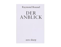
As a young man, Raymond Roussel admired the fantastical tales of Jules Verne and dreamed of similar literary success. With...
As a young man, Raymond Roussel admired the fantastical tales of Jules Verne and dreamed of similar literary success. With inexhaustible powers of observation and a near obsessive focus on incidental minutiae, he honed his words into verses that conjured up entire imagined worlds. Though he never got the scholarly recognition he craved, the Parisian avant-garde embraced his work, which remained influential right up until the nouveau roman movement of the 1950s.
Now three epic poems from 1904 have been published in the form of a bilingual student edition. To ensure readers can appreciate their rhymes and metric rhythm in full, the German lines are juxtaposed with their French counterparts. Subtle typographic interventions create a kind of double type area: included primarily for reference, the original French uses a smaller type size than that of the German verses on the right, and the fact that the latter takes precedence here is emphasised by the centred page number below the right-hand column. In other words: as a margin, the left-hand column would be too wide in relation to the main body but, in combination with the two contrasting typefaces and the centred running heads below, its unusual width gives it a life of its own, introducing a little (but not too much) competition between the columns, one of which has a narrow semibold sans serif, the other a timeless roman font. What is it Roussel says in line 293? “Aux mille petits faits dont s’émaille l’histoire”.
- Publisher:
- Topic:
- Poetry
- ISBN:
- 978-3-945421-15-4
- Author:
- Raymond Roussel
- Illustrator:
- Pierre-Georges Jeanniot, Madeleine Lemair
- Pages:
- 164
- Format:
- 17 x 24 cm
- Price:
- € 22.00
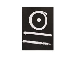
In 1991, a new Berlin night club opened in what were the vaults of a department store from the Roaring...
In 1991, a new Berlin night club opened in what were the vaults of a department store from the Roaring Twenties. That basement space served as a locus for underground dance music, specifically for techno.
This book’s photo section opens with a half-smiley that’s turned sideways. This is followed by a stream of photographs, in which posters promise a “hallucinatory programme of events” and images stop abruptly in the middle of a spread only to re-emerge on other pages. The club-night scenes are reproduced using 10 to 20 lpi halftone screens – an extremely low-tech look for such a high-octane context. The huge halftone dots are a visual translation of the staccato pounding of the drum machines, a reprographic cipher for the repetitive beats. The resolution blurs outlines and has a levelling effect, dots condensing to create a polychromatic swirl, punctuated by flares of brightness, the relentless music seeming to stop for a moment, its pounding bass lost in the darkness, a belly-button piercing twinkling in the spotlights.
The typography’s negative leading squeezes the lines together, lending a new dimension to skim-reading: the letters are so close together that your gaze encompasses myriad stories at once as it attempts to vertically navigate the thickets of type.
The black cover feels like a waxed outer skin. On it your fingers trace a graffiti-style symbol. Some will think it an ominous rune, others know it as a universally recognised signal: it is of course the Tresor logo.
- Publisher:
- ISBN:
- 978-3-98595-312-7
- Author:
- Dimitri Hegemann, Paul Hockenos, Regina Baer
- Pages:
- 352
- Format:
- 21,8 x 30 cm
- Price:
- € 49.00

Wolfen is where East Germany’s entire output of camera film was made. The work was mostly done by women, but...
Wolfen is where East Germany’s entire output of camera film was made. The work was mostly done by women, but previously forced labour was also used. The light sensitivity of the film required darkness, meaning the work went unseen.
Wolfen is also a multimedia installation by Tobias Zielony, in which the artist explores the dialectic relationship between exposure and darkness at this eerie place. Key to it is the photochemical soup that gives birth to images and even allows information to be stored for up to a thousand years. The material may live on, but the circumstances of its creation will be long forgotten, be it the use of animal-derived gelatine for film coatings, the contamination of waste water with silver compounds or the steam generated during production, not to mention the smell.
And finally Wolfen is the name of this book that gives permanent, printed form to Zielony’s temporary installation. In it, we see photos of women in oddly dance-like poses, the camera’s flash picking them out against the darkness. Brief quotes from former employees describe the nature of the work; their words are set opposite the images on paper so thin that, in the solid black areas, the ink shows right through. It’s not that they are printed too pale. Instead, this spectral, veil-like effect is created by very fine halftoning. On other pages, areas of coarse grey are suggestive of white noise, or perhaps coded signals from outer space. In fact, they are highly condensed QR codes. Today, the Wolfen plant makes archival film that lasts for up to 1,000 years; it allows QR codes to be stored as analogue images that can be used to decode the digital source data. Conservation for information – lest it become obscured by the veil of time.
- Publisher:
- ISBN:
- 978-3-95905-707-3
- Author:
- Tobias Zielony
- Pages:
- 212
- Format:
- 22 x 32,5 cm
- Price:
- € 32.00