The Most Beautiful German Books 2025 - Die Schönsten Deutschen Bücher 2025
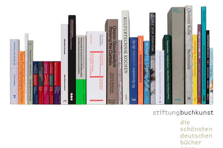
The selection covers a broad spectrum: five books are awarded in each of the five categories: ‘General Literature,’ ‘Scientific Books, Reference Books, Textbooks,’ ‘Guidebooks, Non-fiction,’ ‘Art Books, Photo Books, Exhibition Catalogues,’ and ‘Children's Books, Young Adult Books.’
All award-winning titles will be presented at book fairs in Germany and abroad as well as in numerous exhibitions in libraries and bookshops over the coming months. The permanent exhibition in the foyer of the Literaturhaus Frankfurt and the terrace talks at the PalaisPopulaire in Berlin will also continue.
Single title
“A book full of power and dignity that tackles a horrific subject in a vivid, respectful and brave way” was...
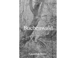
“A book full of power and dignity that tackles a horrific subject in a vivid, respectful and brave way” was the jury’s verdict on this moving photobook. Over the course of seven years, photographer Christian Rothe criss-crossed the expansive former site of the Buchenwald concentration camp, taking pictures with an analogue large-format camera. To grasp the detail of what they capture, close study is required. Barely recognisable foundations, impenetrable scrub, almost imperceptible steps and rotting trackbeds can be made out in these images, which seem to exude a kind of reproving silence.
It’s a difficult subject, but the sensitive book design makes it surprisingly accessible, right from the understated, gauze-clad cover. The embossed and centred title has a forceful presence, while the tangible texture lends the trees’ shadows a three-dimensional feel.
Having thus been respectfully led towards the book’s contents, you immerse yourself in the photos. Atmospheric and of impressive depth, they are printed on high-quality uncoated paper using frequency-modulated screening. In conjunction with passages from well-known novels by former concentration camp inmates, they provide a reading experience that stirs the emotions but still permits a certain distance.
These excerpts are carefully interspersed among longer sequences of photographs, acting as a welcome break from the work of exploring the traces of a harrowing history. Aided by the harmonious interplay of design, materiality, printing and binding, Buchenwaldis a wholehearted work that will continue to resonate long after you’ve put it down.
- Publisher:
- Topic:
- Non-fiction
- ISBN:
- 978-3-96070-125-5
- Author:
- Christian Rothe
- Pages:
- 240
- Format:
- 21,5 x 33 cm
- Price:
- € 38.00
Featuring a luminous screen-printed soft neon on a black background, the cover makes you curious to know more about the...
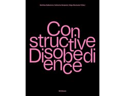
Featuring a luminous screen-printed soft neon on a black background, the cover makes you curious to know more about the kind of disobedience advertised by its title. An exhaustive documentation of the Constructive Disobedience conference, the book presents innovative experimental architecture projects from the fields of teaching, research and practice. The focus is on bio-based and regenerative building methods such as those using pure wood, hempcrete, bacteria, straw or rammed earth – methods that run counter to current industry methods and aim to inspire a green transition within construction.
Muted yet striking, the distinctive colour concept provides a robust framework for the various perspectives and subject areas. The use of soft-pink backgrounds for certain pages cleverly lends structure to the contents, as do the noticeable changes between coated and uncoated paper. The typography has a similarly dynamic feel; though it features just a single font, the different styles and sizes provide a high degree of variation. A particularly successful example of this playful typographical approach can be seen on the chapter dividers, where large lettering snakes across double-page spreads. Another charming and helpful detail is the way references within the running copy are set against colour backgrounds – naturally, these, too, are in the aforementioned pink spot colour. Despite its large format, the book offers excellent openability thanks to its well-made hollow spine. “A thoroughly attractive object with an ingenious two-tone colour scheme” was our judges’ verdict.
- Publisher:
- Topic:
- Academic book
- ISBN:
- 978-3-0356-2829-6
- Author:
- Matthias Ballestrem, Katharina Benjamin, Helga Blocksdorf, u.a.
- Pages:
- 296
- Format:
- 23 x 30 cm
- Price:
- € 52.00

Volume 13 of the Volte Expanded series...
Volume 13 of the Volte Expanded series
The latest title in this series of small-format books documents the results of an experiment by Alexander Kluge. The 92-year-old author and film-maker set out to explore how AI image generator Stable Diffusion might reimagine a range of stories. By feeding it with creative prompts, he was able to use his “virtual camera” to produce unusual images. In the accompanying essay, Kluge reflects on this approach, in which the randomly generated and the erroneous open up new conjunctions of words and pictures.
In the absence of dust jackets, the title of each book is unpretentiously communicated via a tucked-in piece of paper. The different cloth covers, meanwhile, offer an upmarket look and also create a colour code for this multi-volume series. The inside pages are of Bible paper and superbly printed. The alternation between sections of text and AI-generated images repeatedly makes you stop and think, while the spot colours – chosen to match the cover colour – contribute to an inviting overall look.The sensitively chosen materials and meticulous binding met with the judges’ approval, as did the “elaborate interior design, which successfully blends traditional and modern elements”. Both in their individual look and their role within the series, the volumes are testament to a well thought-out concept, one that’s also reflected in the differing yet coherent-looking spines. In addition, the high-quality typography nicely balances out the density of the text. “Small books that make a big impression” was the jury’s verdict.
- Publisher:
- Topic:
- Fiction
- ISBN:
- 978-3-95905-836-0
- Author:
- Alexander Kluge
- Pages:
- 480
- Format:
- 9 x 14 cm
- Price:
- € 26.00
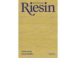
This book traces the author’s very personal quest to find her own self. She offers up fragments from youthful diary...
This book traces the author’s very personal quest to find her own self. She offers up fragments from youthful diary entries that lay bare the dilemma of female adolescence – of having to make your way in a patriarchal world whose deep-seated gender roles, supposed ideals of female attributes and gender-based objectives are more a cause of bewilderment than a source of direction. “Growing up made me smaller”, she writes. “Now I dream of giants – of their audacity, their strength.” The author moves between recollection, self-reflection and literary and cultural digressions, blending her own thoughts with quotes and excerpts.
The immensely powerful words crash and ripple metaphorically against the atmospheric single- and double-page photographs, in which the surfaces and formations of stones and rocks provide a visual link to the imagined world of giants. The author’s blunt, raw language is echoed by the tactile cloth cover and captured via a well thought-out layout, the unconventional use of footnotes and playful typesetting reflecting her inner turmoil and conflicting emotions.
Numerous refined touches make Die Anrufung der Riesin an essay you can almost feel. Carefully combined typefaces and the reader-friendly shade of the paper draw you straight into the text, while the colour-coordinated bookmark ribbon, part of a harmonious overall colour scheme, further underlines the attention to detail.
- Publisher:
- ISBN:
- 978-3-922895-68-8
- Author:
- Lisa Krusche
- Pages:
- 128
- Format:
- 14 x 21 cm
- Price:
- € 24.00
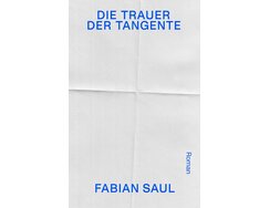
The word “Roman” (meaning novel) adorns the radically pared-back front cover of this debut work by Fabian Saul. It could...
The word “Roman” (meaning novel) adorns the radically pared-back front cover of this debut work by Fabian Saul. It could be read almost as an explanation, given the highly unconventional way in which Die Trauer der Tangente tells its story. In a series of fragments, the protagonist remembers a deceased friend whose death shook the foundations of his own life. Various people, places and memories are sketched out in brief paragraphs so that a kind of polyphonic web of recollection unfolds. The author thus poetically outlines the way things were and might have been.
In the absence of a linear narrative, the book design plays a particularly important role in lending structure to this powerful work, with a refined marginal column for notes on places and people providing orientation and assistance. The typography is otherwise pleasingly conservative, never attempting to upstage the content. The thoughtful and precise details not only attest to the designer’s skill, they also significantly aid the flow of the text, which jumps abruptly between memory fragments relating to different people and narrative flashbacks, presenting a challenge for the reader.
With a simple cover featuring nothing but paper creases, the title and the author’s name, the book design initially seems extremely understated, despite the eye-catching colour-coordinated headband and matching bookmark ribbon. It’s only when you start reading that you appreciate the full extent of its achievement – the design interacts with the text, creating a fascinating whole.
- Publisher:
- Topic:
- Fiction
- ISBN:
- 978-3-7518-0064-8
- Author:
- Fabian Saul
- Pages:
- 320
- Format:
- 14,5 x 22cm
- Price:
- € 26.00
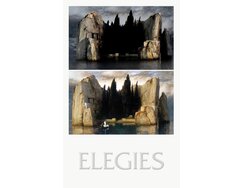
In his poetic, associative Histoire(s) du cinéma series, which he began in 1988, Jean-Luc Godard related the development of cinema...
In his poetic, associative Histoire(s) du cinéma series, which he began in 1988, Jean-Luc Godard related the development of cinema to the history of the 20th century, reflecting on the medium using quotes from video, audio and written-word sources. Elegies takes a selection of text fragments from that work, rearranging them and juxtaposing them with carefully selected images. In this way, it aims to convey the power of imagery within a discourse.
The highly unusual format plays a key part in realising this objective. Presented as twin volumes within a double gatefold, it forces the reader to engage deeply and interactively in order to appreciate its contents. The written-word volume on the left-hand side thus contains footnotes that refer to the corresponding visuals in the right-hand volume. This parallel reading experience works surprisingly well and provides an almost sensory kind of enjoyment. A contributing factor is the first-class binding, which makes for optimum openability. In addition, the exposed spines, through which the back edge of each volume is visible with the book closed, are as visually appealing as the understated layout.
The judges also cited the highly effective combination of typefaces – a serif for the written-word section and an expressive sans serif for the image section, while the way headings run across the gutter creates an appealing unifying effect. Add in refined cover embossing that looks almost like it’s been carved in stone, and you have a tactile work of art that invites exploration.
- Publisher:
- ISBN:
- 978-3-944425-37-5
- Author:
- François Charbonnet, Francisco Moura Veiga, Marine de Dardelle, Joshua Guinness
- Pages:
- 304
- Format:
- 11,5 x 18,5 cm
- Price:
- € 25.00
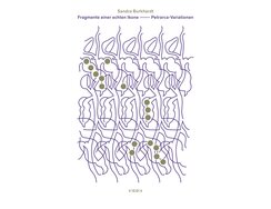
“A fabulous illumination of verse via masterful design” was the jury’s verdict on this refined soft-cover book. In fact, this...
“A fabulous illumination of verse via masterful design” was the jury’s verdict on this refined soft-cover book. In fact, this exploration of Petrarch’s poetry works on two different levels, taking its cue, as the author says, from Oskar Pastior’s 33 Gedichte from 1983, in which Pastior examined numerous Petrarch poems and translated them in highly idiosyncratic fashion. Fragmente einer echten Ikone picks up the thread, juxtaposing Petrarch’s poems with the author’s own interpretations – or “flawed replications and unfitting translations”, as she calls them in the jacket copy.
Adorning the cover is a suitably poetic illustration that seems to comprise interwoven motifs, with one emerging out of the other. It piques the reader’s interest, making us curious about the titular “Petrarch variations” within. Inside, two booklets face each other within a double gatefold – the modern interpretations on the left-hand side, the Italian originals on the right. A harmonious colour scheme unifies the two parts, while the pleasing feel encourages you to engage with their contents. Refined design details subtly differentiate the two volumes: where Petrarch’s originals are set in conventional paragraphs, the author’s texts are entirely devoid of blank lines. The different eras are thus reflected not just in the language but via the design too.
“A thoroughly cohesive overall concept” was how our judges summed up the visually subtle yet highly effective design approach, which affords the poems sufficient space and offers today’s readers a way in to the work of one of Italy’s greatest poets.
- Publisher:
- ISBN:
- 978-3-948336-19-6
- Author:
- Sandra Burkhardt, Francesco Petrarca
- Pages:
- 84
- Format:
- 17 x 24 cm
- Price:
- € 26.00
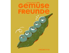
On the cover of this vibrant cookbook, giggling peas with neon-hued cheeks invite the titular “Gemüsefreunde” (“Friends of Vegetables”) to...
On the cover of this vibrant cookbook, giggling peas with neon-hued cheeks invite the titular “Gemüsefreunde” (“Friends of Vegetables”) to browse recipes sourced from the author’s own friends. The 63 keen amateur chefs contributed 112 of their favourite recipes; these were then grouped into no-nonsense categories such as “Ganz einfach” (“Quick and easy”), “Wenig Zeit” (“Pushed for time”), “Nur du & ich” (“Just the two of us”), “Wow-Effekt” (“Wow factor”) and “Bring was mit” (“Bring something to share”). As soon becomes clear, these are not dishes that require tweezers, nitrogen or the like; instead, they simply celebrate the joy of cooking and the everyday appreciation of vegetables.
Featuring bright and brilliantly rendered colours, the author’s charming illustrations guide you through the recipes and ensure you won’t miss the more genre-typical photographs. They create a cheery vibe that soon wins you over, with the cohesive blend of materials adding a further sensory element to the reading experience. The pages’ clean layout and sensible mix of typefaces make them easy to follow even as you cook, while the pleasing format and flawless binding also earned praise from our judges.
In book design as in food, subtle nuances can make all the difference. In Gemüsefreunde, every detail is thus in harmony with the whole, from the colour-coordinated bookmark ribbon and spine tape to the tangible deep embossing of the cover. “It makes you want to get cooking,” the judges remarked.
- Publisher:
- Topic:
- Non-fiction
- ISBN:
- 978-3-948743-38-3
- Author:
- Sabine Kranz
- Pages:
- 180
- Format:
- 20 x 22,5 cm
- Price:
- € 34.00
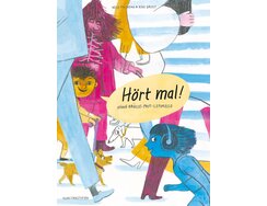
There can’t be many games that have been making children chuckle for generations, but Chinese Whispers is surely one. Hört...
There can’t be many games that have been making children chuckle for generations, but Chinese Whispers is surely one. Hört mal! takes the repeated misquoting that makes the game such fun and turns it into a concertina-fold book – though here the relayed sentence is not so much whispered as shouted. The fold-out format makes the chain of events easier for the reader to follow and lends the book a dynamic feel.
“Ihr könnt euch mal gehackt legen!” (“You can all take a running jump!”) yells a man to a crowd outside a supermarket, triggering a series of vignettes showing how his words are misunderstood by everyone from a bike-seller to a policeman on the beat.
Rendered in sketch-like illustrations that use just a few colours, the various characters capture the reader’s attention thanks to remarkably precise facial expressions. Each double-page spread is full of things for kids to discover, and adults too will doubtless enjoy poring over the amusing street scenes. The reading experience is further enhanced by refined lettering that strikes the right balance between approachable handwriting style and carefully judged proportions.
This entertaining story is likely to be read and re-read (aloud or otherwise), and that’s something the makers clearly took into account, the premium paper and quality construction making for optimum openability and excellent durability. It’s a book that “lifts the spirits” said our judges, who also noted how cohesive the overall design is, right down to details such as the attractive spine.
- Publisher:
- Topic:
- Children’s/young adult book
- ISBN:
- 978-3-948743-36-9
- Author:
- Rike Drust
- Pages:
- 16
- Format:
- 13,8 x 18,5 cm
- Price:
- € 20.00
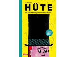
Via a highly distinctive illustration style and age-appropriate texts, the author of this book on hats provides lots of information...
Via a highly distinctive illustration style and age-appropriate texts, the author of this book on hats provides lots of information but also stimulates children’s curiosity. There’s such a wide range of things to discover, with sombreros, chef’s hats, and tin-foil hats presented alongside religious, protective and status-related headgear. In addition to a broad cultural spectrum, the featured items also cover various different professions and historical eras. Baseball caps inevitably make the cut, but so do laurel crowns, bridal veils, diving helmets and even Napoleon’s tricorn.Painstakingly rendered using oil pastel crayons, the expressive illustrations feature an unusual colour scheme. Figures boast contrasting hues within prominent black outlines, while spot colours create particularly bold splashes. The charming visuals are accompanied by a clear sans serif type, with the headings subtly echoing the illustration style. A rough paper that offers a pleasing tactility perfectly complements the overall look.This meticulously sewn book is also notable for its narrow format, something the author uses to good effect. A guessing game then provides a fitting finale: the last double-page spread presents a bird’s eye view of various head coverings which readers are invited to identify. This is an informative and entertaining compendium that, right to the end, can take even adults reading it aloud by surprise.
- Publisher:
- Topic:
- Children’s/young adult book
- ISBN:
- 978-3-551-52291-7
- Author:
- Karen Exner
- Pages:
- 88
- Format:
- 20,4 x 32,4 cm
- Price:
- € 18.00
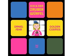
The Rubik’s Cube has fascinated generation after generation with its deceptively complex simplicity. Published to mark its 50th year –...
The Rubik’s Cube has fascinated generation after generation with its deceptively complex simplicity. Published to mark its 50th year – it was invented by Ernő Rubik in 1974 – this book introduces children to its story and mechanism.
With the aid of explanatory panels, this graphic storybook is about a boy who finds a Rubik’s Cube and starts puzzling over it. He lets his dad have a go, takes it to school with him, then sets about learning more about the cube and how to solve it. Thus begins an exciting journey of discovery …
Lively illustrations in vibrant spot colours immediately draw you into the entertaining narrative, whetting your appetite for facts, figures and background knowledge. The varied perspectives mean you never get bored and lend the illustrations a dynamic feel. Excellent readability is ensured by the sans serif typeface, which the judges commended as “very appealing and appropriate”.
A particular highlight is the attractive cover. Here, a die-cut grid with rounded corners adds a playful element; within it, we see the story’s main protagonist. This shape forms a key motif in the inside pages too, thus providing a consistent visual link. Another charming detail is the disclaimer on the inside back cover. It asks readers to excuse any errors that may have crept into the book; after all, the Rubik’s Cube is not an easy thing to tackle.
- Publisher:
- Topic:
- Children’s/young adult book
- ISBN:
- 978-3-314-10696-5
- Author:
- Daniel Fehr
- Pages:
- 48
- Format:
- 24,6 x 24,4 cm
- Price:
- € 20.00
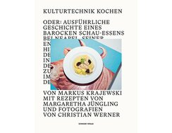
Oder: Ausführliche Geschichte eines barocken Schauessens bei Neapel, seiner Entstehung und Hintergründe sowie der Reise nach Italien in vier Etappen...
Oder: Ausführliche Geschichte eines barocken Schauessens bei Neapel, seiner Entstehung und Hintergründe sowie der Reise nach Italien in vier Etappen nebst delikaten Rezepten zum Nachkochen.
Or: A detailed history of a baroque banquet near Naples, its origins and background, as well as a four-stage journey to Italy, accompanied by delicious recipes to try at home.
Back in the Middle Ages, chefs would serve up banquet showpieces that were less about satisfying diners’ appetites and more about creating a visual impression. They tended to feature whole animals, often of the less palatable variety, prepared and presented so that they looked as life-like as possible. For this opulent book, a chef, a photographer and a cultural historian set about investigating this phenomenon via the recreation and contemporary reinterpretation of “a baroque showpiece near Naples”.
The dissonance such an epoch-spanning project inevitably entails is subtly echoed by the book’s design. With its serif font, the cover typography has a historical feel, except that the type is partially obscured by the photo card that has been laminated onto the cover. The temptation aspect of those showpieces – the aromas, textures and taste – is translated into a photographic concept featuring clear subject matter and beautifully coordinated colours.
The publishers describe it as an “academic cookbook”. It’s hard to argue with that description, and yet it doesn’t do justice to the joy that went into the book’s design, which offers such surprises as a historic image on the front endpaper plus an amusing contemporary counterpart on the back endpaper. Combined with generous amounts of white space, the precise typesetting uses the large format to good and aesthetically pleasing effect, as our judges were keen to note. Also singled out for praise was the way the book limits itself to just two styles of a single typeface. The chosen materials and high-quality construction, meanwhile, help to ensure the book succeeds in combining the heft of a piece of cultural history research with the light touch you’d expect of a cookbook.
- Topic:
- Non-fiction
- ISBN:
- 978-3-7965-4956-4
- Author:
- Markus Krajewski, Margaretha Jüngling, Christian Werner
- Pages:
- 176
- Format:
- 24 x 31 cm
- Price:
- € 39.00
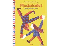
This colourful book is sure to keep kids active and boredom at bay, thanks to a plethora of uncomplicated games...
This colourful book is sure to keep kids active and boredom at bay, thanks to a plethora of uncomplicated games ideas. Clearly categorised according to the number of participants – two, three to five, six or more, plus a section on gym-hall games – the activities promote dexterity and invite children to test their strength and each other’s, while putting fun front and centre. All this is preceded by an age-appropriate explanation of the rules of fair play.
The lively illustrations are supported by a vibrant colour scheme and clear typography, while the judges were also impressed by the sumptuous print quality and well-rendered overprinting. A particularly attractive feature is the double-page chapter dividers, which provide islands of calm amidst the otherwise dynamic rhythm of the layout. Another recurring theme is the consistent use of decorative page borders that vary in pattern and position, being sometimes at the top or bottom and sometimes at the sides. These also provide visual orientation, with each chapter having its own border variant. The printed endpapers also bear one of these patterns, thus creating a visual link with the contents pages.
Thanks to the high-quality construction, practical format and hard-wearing cover, the book should be able to handle a good many outdoor games sessions. If it had a motto, it might be: “Put down your devices and play Octopus, Flying Carpet or Newspaper Fencing instead!”
- Publisher:
- Topic:
- Children’s/young adult book
- ISBN:
- 978-3-89565-469-5
- Author:
- Michael Heinze, Katrin Stangl
- Pages:
- 96
- Format:
- 17 x 23 cm
- Price:
- € 20.00
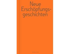
Produced in connection with the Offenbach-based literature festival “Text Matters. Matters of Text”, this compact collection presents intelligent stories by...
Produced in connection with the Offenbach-based literature festival “Text Matters. Matters of Text”, this compact collection presents intelligent stories by seven authors. They are, says the jacket copy, about what it takes to talk about a world that is no longer what it never was and never will be.
Elegantly set in Mimesis, a sans serif typeface developed exclusively for the festival, the pages use a two-colour scheme that’s like a comforting hug for the reader, the warm, metallic bronze contrasting with neon orange. The type area has a bold look and is flanked by unusually positioned page numbers, and yet overall there is a pleasing flow to the pages. The subtly tinted, high-quality paper has a satisfying feel while the first-class printing brings the best out of the unusual colour concept. “Experimental yet very easy to read” was the verdict of our judges, who also praised the refined typesetting solutions for the different essays.
The handy size and finely textured cloth cover rather call to mind pocket Bibles, an association that’s probably no coincidence given how meticulously the book has been designed. What’s indisputable is the way the type density and white space help to showcase the essays’ poetic language, maximising the impact of finely turned sentences such as: “This book is full of gaps. You could say it keeps shtum at key moments.”
- Publisher:
- ISBN:
- 978-3-00-080088-7
- Author:
- Tanasgol Sabbagh, Heike Geißler, Enis Maci, Eva von Redecker, Moshtari Hilal, Sinthujan Varatharajah, Judith Schalansky, Holm-Uwe Burgemann
- Pages:
- 224
- Format:
- 12 x 18 cm
- Price:
- € 18.00
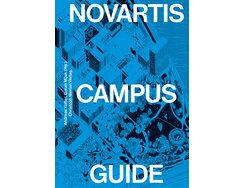
Over the course of two decades, Novartis has succeeded in transforming its Basel headquarters from an industrial site into an...
Over the course of two decades, Novartis has succeeded in transforming its Basel headquarters from an industrial site into an open campus – an attractive and accessible space in which people can come together. Designed by various renowned architects, the buildings form an ensemble that encourages exploration. Such exploration is now made easier via this guide, which offers a curated campus tour and comes in a handy format.
It’s visually impressive from the start, with the cover featuring a black-and-white illustration of the site on a bold blue background. Title, authors and publisher are printed in bright white on the protective plastic jacket – the latter is eminently practical given the volume’s intended use as a robust guidebook. The interior opens with a series of images that whet the reader’s appetite for their tour, providing initial impressions along with graphical page references.The following pages then present the individual buildings in words and pictures, and with the aid of a vibrant page design. The clear layout and useful navigational elements ensure you never lose your bearings, making it easy to absorb the key facts even when flicking back and forth.
The judges were impressed by the dynamic typesetting, detail typography and high-quality visuals, as well as by the way the designers have made good use of the inside covers, which feature a site map and key for effortless orientation. This is a book that makes you want to explore the architecture and, thanks to its durable construction, is tough enough to be a genuinely usable guide.
- Publisher:
- Topic:
- Guide
- ISBN:
- 978-3-03969-021-3
- Author:
- Andreas Kofler , Goran Mijuk
- Pages:
- 228
- Format:
- 15 x 21 cm
- Price:
- € 29.00
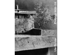
Built in 1928, Leipzig’s Schule der Arbeit was designed to provide a blueprint for a modern school. Both educationally and...
Built in 1928, Leipzig’s Schule der Arbeit was designed to provide a blueprint for a modern school. Both educationally and architecturally, it took its cue from the needs of the young workers who would live and learn there. After it was attacked by Nazi stormtroopers in 1933 and its building subsequently seized, the project came to a premature end.
Here, Ute Richter delves into its history and its special premises, examining them from various perspectives. Texts by the architect Johannes Niemeyer, by founder and teacher Gertrud Hermes and by the author Radek Krolczyk complement her own observations. Impressively supported by the few surviving original documents, they gradually paint a clear picture of this progressive concept and its impact.
With its captivating monochrome arrangements of texts and pictures, the book boasts an extremely consistent look. The open-spine soft cover’s sewn, neon-hued binding adds a welcome eye-catcher and also makes for optimum openability. The well-judged ragged-right type columns are a particular plus on text-heavy double-page spreads, while the chosen fonts also help to provide structure. Thanks to their striking bold type, quotes from former students – Gertrud Hermes had devised a questionnaire to record their thoughts, concerns and desires – are clearly set apart from the running copy, providing an additional layer for the reader to engage with. The wide type area, which almost runs into the gutter, may seem slightly jarring, but its effect is to increase the visual density of the contents, making this examination of an unusual educational model and its historical context feel all the more focused.
- Publisher:
- Topic:
- Non-fiction
- ISBN:
- 978-3-95732-617-1
- Author:
- Ute Richter
- Pages:
- 128
- Format:
- 16,5 x 21,6 cm
- Price:
- € 24.00

In this substantial volume, the author revisits the planning and construction of two Soviet-era opera houses – the Opera and...
In this substantial volume, the author revisits the planning and construction of two Soviet-era opera houses – the Opera and Ballet Theatre in Vilnius (built 1962–1974) and the Comic Opera in Minsk (built 1973–1981) – both of which were designed by important female architects. She illuminates each building’s genesis, setting it in its historical, political and cultural context. The book also sheds light on processes of Soviet nation-building and on the extent to which architecture played a role in the Soviet Union’s collapse.
Featuring a pared-back, typographic design, the dust jacket is particularly notable for the material’s exceptional tactility. Removing the jacket reveals an exposed spine and a blank cover in bold purple, the matching sewn binding underlining the design’s attention to detail. Inside, subtly chosen typography and an audaciously high type area emphasise the quality of the design. The centred, fully justified type column for the running copy is a similarly well thought-out detail, allowing the generous margins to be used for the many footnotes as well as for illustrations and their captions. This makes for an effortless read while creating a dynamic overall effect.Equally noteworthy is the impressively sharp printing, be it on the rough, uncoated paper or the semi-gloss art paper used for the colour-photo section at the end. Alongside the optimum openability, this change in material within a coherent overall concept was particularly commended by our judges.
- Publisher:
- Topic:
- Academic book
- ISBN:
- 978-3-95905-802-5
- Author:
- Oxana Gourinovitch
- Pages:
- 356
- Format:
- 20 x 28,7 cm
- Price:
- € 42.00
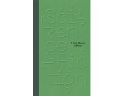
First, our attention is held by the deep-embossed title that winds its way strikingly around the cover. Then it’s time...
First, our attention is held by the deep-embossed title that winds its way strikingly around the cover. Then it’s time to delve into the conceptually ambitious contents, in which a team of authors interrogates human projections and representations of the world of plants. Science / Fiction. A Non-History of Plants brings together artistic, technological and scientific perspectives from the mid 19th century to the present day. In the process, it employs the logic of a science-fiction novel as it progresses from familiar to unfamiliar worlds. Works by more than 30 artists from various eras enliven this literary kaleidoscope, in which botanical facts and fictional narratives intertwine.
“This book simply breathes science” stated the judges, who were impressed by the finely balanced typesetting and by the typography. A typeface with a historicist yet contemporary look is used to good effect, especially on the green chapter dividers, while the more playful ornamented font of the cover title also features in the full-page quotes, which, like the bespoke layouts for the art pages, break with the clearly defined grid. The works are sympathetically presented, accompanied by type that is sometimes bled off and sometimes set in mirrored columns. Thoughtfully placed changes of paper help to subtly structure the contents. The lavish, glossy picture pages are thus printed on smooth paper, while the text pages use a tactile tinted paper type that makes them easy to read. Also worthy of mention in this context is the printing’s precise colour matching, which further adds to the cohesive overall experience.
- Publisher:
- ISBN:
- 978-3-95905-858-2
- Author:
- Felix Hoffmann, Simon Baker, Giovanni Aloi, Natsumi Tanaka, Michael Marder
- Pages:
- 216
- Format:
- 15 x 23,5 cm
- Price:
- € 40.00
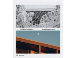
From the cloth dust jacket on, this monograph is a tactile delight. Dedicated to the work of Mork-Ulnes Architects, an...
From the cloth dust jacket on, this monograph is a tactile delight. Dedicated to the work of Mork-Ulnes Architects, an international architectural practice with offices in Oslo and San Francisco, The Craft of Place features a pair of cropped cover images that references the firm’s philosophy. Its works combine Scandinavian pragmatism and California’s spirit of innovation, and both aspects are clearly reflected in this book.
The Swiss binding results in excellent openability, allowing readers to easily flick through the pages, though their fingers may prefer to linger over the cover’s perfect embossing. Inside, generously dimensioned photos, precise planning drawings and axonometric projections catch the eye, especially when set against black backgrounds as in the introductory pages. The alternation between black and white pages also lends structure to the contents and guides the reader through the monograph’s various sections. The clear, high-contrast typography and distinctive typesetting reflect the architectural subject matter in compelling fashion, with the highly unconventional index in particular having a distinctly geometric feel.
The images, on the other hand, exhibit a striking nonchalance, emphasising the connection to nature the architects are always seeking to achieve. Harmonising nicely with the slightly rough feel of the interior paper, they allow the reader to enjoy an architectural exploration. In book design as in buildings, intelligent details make for a better user experience; here, the elegant jacket’s removable bar code is a case in point, a thoughtful touch that will gladden the bibliophile’s heart.
- Publisher:
- Topic:
- Academic book
- ISBN:
- 978-3-03860-379-5
- Author:
- Casper Mork-Ulnes
- Pages:
- 256
- Format:
- 23 x 27 cm
- Price:
- € 48.00

This weighty tome features more than 400 traditional timber joints from around the world. The encyclopaedia-style structure and simple illustrations...
This weighty tome features more than 400 traditional timber joints from around the world. The encyclopaedia-style structure and simple illustrations make it easy to find and compare the various techniques, and lend the book a multi-purpose character. For wood aficionados, designers, craft professionals and architects, The Joinery Compendium is both a source of inspiration and a practical handbook.
Its 896 pages are notable for their consistent layout grid, impressive clarity and striking two-colour printing. The carefully chosen typefaces and strict page structure facilitate the harmonious presentation of German, English and Japanese terminology. Precise drawings stand out against the velvety paper, the off-white shade of which creates a pleasing contrast. The spreads offer a nice balance between left- and right-hand pages, while the layout’s geometric principles allow for aesthetically pleasing combinations of words and images. “Clear, neatly arranged and well thought out” was the conclusion of our judges, who also appreciated the way the book nods to Japan but avoids clichés and cultural stereotypes.
The rigorously minimalist look thus continues all the way to the back cover, where even the EAN code has been elegantly integrated into a drawing. In our judges’ view, this meticulously put-together, cloth-bound book impresses as a coherent whole that reflects the precision of woodwork in winning fashion.
- Publisher:
- Topic:
- Academic book
- ISBN:
- 978-3-944074-52-8
- Author:
- Sascha Bauer, Daniel Pauli
- Pages:
- 896
- Format:
- 17 x 24 cm
- Price:
- € 96.00
