
The Best German Book Design 2023
stiftung buchkunst awards the best german book design of a year, offers a platform for rethinking the medium of the book with the sponsorship prize for young book design, and networks international book design competitions under the umbrella of best book design from all over the world.
Single title
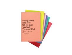
With its new and ever expanding theatrical imprint, Suhrkamp is enabling culture fans to not only see contemporary plays on...
With its new and ever expanding theatrical imprint, Suhrkamp is enabling culture fans to not only see contemporary plays on stage, but also to hold them and pop them in their pocket.
The textured linen bookcloth invites you to run your fingers over the cover. Play, author and imprint name are set in black lettering on bold backgrounds, all arranged vertically and printed in the same point size, but in decreasing weights. This left-aligned block is positioned unusually close to the edge of the spine, where normally you’d find the creases of the cover’s joint; here, though, these have been omitted in order to maximise the impact of the bold colour.
The three edges of the book block are in contrasting colours and these, in turn, vary from book to book, allowing Cubist-esque towers or tessellations to be created by arranging multiple volumes horizontally or in flush or offset stacks. The most striking effect of all is achieved by stacking the books and shifting each one slightly upwards and to the left. Certainly it would be a shame to stow them neatly on shelves, with only the spines on show.
Suhrkamp has form with this kind of visual theatre: for more than half a century, the publisher’s Edition Suhrkamp imprint has been bringing rainbow effects to domestic living rooms, with each book bearing a different hue and bibliophiles sometimes buying books just to fill gaps in their library’s colour sequence. The new imprint’s bold look could thus be seen as a tribute to Willy Fleckhaus, creator of that now legendary design.
- Publisher:
- ISBN:
- 978-3-518-43096-5
- Author:
- Thomas Köck
- Pages:
- 184
- Format:
- 12,5 x 19 cm
- Price:
- € 16.00
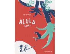
On discovering a gate with bent railings, two friends sneak into the enchanting garden beyond. There, the boy and girl...
On discovering a gate with bent railings, two friends sneak into the enchanting garden beyond. There, the boy and girl spot a cat, which they hastily pursue across the following pages. Reaching a pond in the middle of the book, they pause on its stepping stones and bend down to look at themselves in the water. At this magical moment, the story turns on its head and continues by way of the reflection. You thus upend the book and leaf backwards through its pages until you reach the beginning – where you had hitherto expected to find the ending – at which point the adventure starts afresh.
Without such a detailed description, it would be hard to appreciate just how the clever this wordless book’s ideas and compositions are. In the new story, the pair experience remarkably similar escapades, except now they find themselves in the jungle. Where previously you might have been struck by the spiral shells of the garden’s snail, here you find curly-tailed chameleons huddling in the rolled-up fronds of giant ferns. Where a hosepipe looped across a double page, spraying water in the children’s direction, now a snake uncoils itself and flicks its tongue towards them. Where laundry pegs snapped open and shut in the garden, now crocodiles snap their jaws in a mangrove swamp.
Rarely does a book make you want to flip back and forth and turn it about as much as this, so astoundingly similar are the scenes across the two strands. Their parallel forms are as closely related as dream and reality.
- Publisher:
- Topic:
- Children’s/young adult book
- ISBN:
- 978-3-948743-26-0
- Author:
- Reto Cameri
- Pages:
- 56
- Format:
- 978-3-948743-26-0
- Price:
- € 24.00
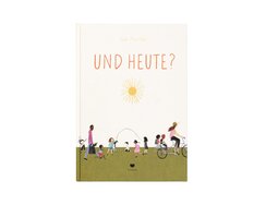
“Self-empowerment in childhood” might be a fair summary of this book’s pedagogical approach. It’s an ambitious goal for a world...
“Self-empowerment in childhood” might be a fair summary of this book’s pedagogical approach. It’s an ambitious goal for a world of both limited and unlimited possibilities. How can a child tell whether choice is a luxury or a curse?
“What should I do today?” is just the first of many questions asked within, questions that are each met with a plethora of possible answers. One double page presents various hairstyles and asks whether the reader would like a completely different one. This latter spread provides a particularly good example of the book’s visual strategy: black-and-white drawings of children’s heads are arranged on a slightly grainy, salmon-hued backdrop, showcasing a range of styles that is neither stereotypical nor surreal and caricatured. Instead, the variants are all realistic, not least thanks to the way they are illustrated. It’s a pleasure to simply scrutinise and compare the different kinds of hairstyle – even for those who are happy with their own. The illustrative style calls to mind the way a child holds a pen, and this makes the images all the more relatable. That they manage to capture the essence of a form via just a few simple lines – without resorting to clichés – suggests a deep understanding of the connections between details and whole.
Full-colour pages alternate with white-background pages, some calm, some stimulating, some appetite-whetting, but always using a pastel palette and eschewing technically flawless colour blocks. Their variety nods to life’s many possibilities and is testament to the skill of their illustrator and author, Julie Morstadt.
- Publisher:
- Topic:
- Children’s/young adult book
- ISBN:
- 978-3-95939-212-9
- Author:
- Julie Morstad
- Pages:
- 56
- Format:
- “Self-empowerment in
- Price:
- € 19.00
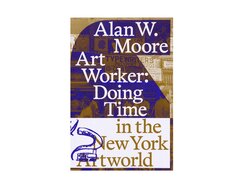
The vibrant New York scene of the 1970s and 80s is the subject of this memoir by Alan W. Moore....
The vibrant New York scene of the 1970s and 80s is the subject of this memoir by Alan W. Moore. The art historian and activist experienced this exciting period of artistic upheaval first-hand, playing his own part in it via video art and installations.
The soft cover of smooth cardstock allows the book to flex easily in the reader’s hands, while its design offers tactile delights, thumbs feeling the high-relief embossing of the cover’s elegant title letters and index fingers tracing the similarly embossed lettering on the back. Sadly, the interior can’t wait any longer, so we duly open up book.
Here, the type area is structured by way of narrow columns positioned symmetrically in the outer sections. They use the full height of the page but keep a clear distance from the book’s gutter, resulting in pronounced margins for annotations. The type area thus starts off symmetrically, but curves and sharp edges soon indent the columns in dramatic fashion, shaping the matter into sculpted forms and claiming additional space. Like side steps in a dance, these typographical indentations create generous openings in the column gutters and result in a reallocation of page space. Annotations are wedged at sharp angles into the body matter and marked by bold dots. The dark violet of the single-colour printing follows the typographic groove and is shown to best effect in the images.
Bibliography and index are included not merely as artistic indulgences but, like the sewn binding, as a means of underlining the book’s documentary character.
- Publisher:
- ISBN:
- 978-0-578-36980-8
- Author:
- Alan W. Moore
- Pages:
- 224
- Format:
- 16x24
- Price:
- € 30.00
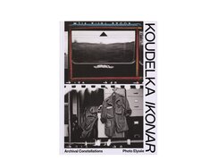
Since 1965, Josef Koudelka has published more than 50 books of photographs. In this most recent exhibition catalogue, the editors...
Since 1965, Josef Koudelka has published more than 50 books of photographs. In this most recent exhibition catalogue, the editors have combined Koudelka’s work with biographical themes.
Besides showcasing his multiple identities in a selection distilled from more than 30,000 contact sheets, the book also features seven chapters, or “Constellations”, dedicated to subjects such as image collecting, book production or the archiving of photos. Printed on matt uncoated paper and set against black backgrounds are enlargements of the previously postage stamp-sized images, with markings and hand-written notes providing insights into his working methods.
The book design harnesses the visual presence of a jet-black, expanded sans serif font, creating black-and-white contrasts that, along with the ratio of white space to type, call to mind the lettering on boxes of photo paper.
The real eye-catchers, though, are the five chapters labelled “Portfolios”. Here, the book switches to a matt paper whose high density ensures pin-sharp printing – the reproductions are of facsimile quality. Framed by ample white space, the photographs come alive, be they stage shots, portraits of Czech Romany life or scenes from the 1968 Soviet invasion of Prague.
The themes of Josef Koudelka’s work are a reflection of his personality, and it shines through in this book. We see the photographer in his sleeping bag, in his studio, at the Magnum offices and amidst the straw of an open field.
- Publisher:
- ISBN:
- 978-3-95905-630-4
- Author:
- Josef Koudelka
- Pages:
- 264
- Format:
- 24 x 33 cm
- Price:
- € 48.00
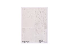
This handbook for architects takes a look at the last millimetre of an interior fit-out, exploring the variety, methods and...
This handbook for architects takes a look at the last millimetre of an interior fit-out, exploring the variety, methods and aesthetic appeal of internal plastering.
Adorning its cardboard cover are chalky white squares in different sizes, photographs of textured plasterwork that highlight its interplay of light and shade; in addition, the cardstock is embossed to create a three-dimensional low relief, causing physical shadow and photographic shadow to merge.
Within, countless images illustrate the techniques and applications of particular wall finishes in both historic and contemporary interiors, while numerous swatch charts provide step-by-step instructions on how different plasters are made. The look of these charts provides for a typographic highlight: a small notch is cut out of the bottom left-hand corner of each image and the resulting white space used to accommodate the image number, the baseline of which is aligned with the image’s edge. This completion of the incomplete rectangle is both subtle and distinctive, and also emphasises the didactic purpose of the images. More notches of white space feature in the type columns, in the form of wide indents, some of which are even doubled. The type area of the interviews has a particularly appealing look, with the initials of the respondent inserted into each question’s indent. Words and pictures are essentially arranged in a four-column grid; this offers great scope for maximising variety across the page layouts.
- Publisher:
- ISBN:
- 978-3-03860-307-8
- Author:
- Annette Spiro, Elizaveta Radi, Florian Schrott
- Pages:
- 312
- Format:
- 20.5 x 28 cm
- Price:
- € 58.00

An artist takes a course in Japanese, keen to immerse herself in its culture before setting out for Japan. Her...
An artist takes a course in Japanese, keen to immerse herself in its culture before setting out for Japan. Her language learning is not a success. All the same, she forms vivid impressions of the country and records these via keywords, an associative process that led to this book. It presents her erratic journey as a glossary in which terms as “umami” and “kintsugi” feature alongside German or English entries. The book retains the tangential aspect of such a trip, with references between entries plunging the reader into the labyrinth of experiences.
The glossary aims for a literary subjectivity and takes the form of a half-book – or, more properly, two half-books, one in German and the other in English. These equal halves each start with their own front cover and meet at their respective ends, forming a kind of double book that invites you to turn it about.
The otabind cover means the cardboard spine is not glued to the page block, allowing the book to be opened easily and without breaking the spine. The same attention to detail can be seen in the chosen binding thread, the grey of which blends nicely with the paper, the glossary being printed in black and white on pale grey, open-pore pages. Here, the paper feels coated, while the single colour sheets interleaved with the quires feel smooth and uncoated, despite their coated surface. They bear abstract, kaleidoscopic images printed in singular fashion – without any kind of screen.
- Publisher:
- ISBN:
- 978-3-86485-275-6
- Author:
- Katrin von Maltzahn, Katrin von Maltzahn
- Pages:
- 236
- Format:
- 15 x 22 cm
- Price:
- € 24.00
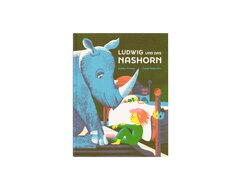
Ludwig maintains there is a rhinoceros in his bedroom, so his father searches in every nook and cranny to prove...
Ludwig maintains there is a rhinoceros in his bedroom, so his father searches in every nook and cranny to prove this is not the case. This escalates into a philosophical conflict which nods to Ludwig Wittgenstein.
A printed front endpaper always makes you want to check whether the printing repeats or differs on the back endpaper. In this case, grasping the page block and tilting it back and forth allows you to compare how the rhino hides amidst the furnishings in each case.
The book’s rich palette is created using just three colours – a highly pigmented cyan, a softly glowing red and a bold yellow – though overprinting increases this to seven. The colours are nicely balanced, with no single hue dominating. The interplay of light and shade is a key element in the compositions, the duality of light and dark helping to ramp up the drama. The way the evening sky glows above the rooftops, the fiery red of the sunset visible just above the gables, is particularly enchanting, while a lively transition into blue leads to a star-filled midnight-blue sky.
Regardless of whether it’s the father or son who bears the burden of proof, the book is positively brimming with rhinoceroses. Without wishing to give too much away, there’s a good reason why the father should have seen rhinos during those discussions with his son – just look at the pattern on his pyjamas.
- Publisher:
- Topic:
- Children’s/young adult book
- ISBN:
- 978-3-314-10631-6
- Author:
- Noemi Schneider
- Illustrator:
- GOLDEN COSMOS
- Pages:
- 40
- Format:
- 21,5 x 28 cm
- Price:
- € 18.00
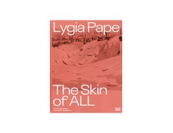
This catalogue accompanying the Lygia Pape retrospective documents her role in the development of Brazilian modernist art. It features alternating...
This catalogue accompanying the Lygia Pape retrospective documents her role in the development of Brazilian modernist art. It features alternating chapters such as “Essays”, “Works” and “Archive” that add up to an extensive volume of material; these are followed by a photo series offering impressions of the exhibition spaces. Pape aimed to do much more than just echo the European avant-garde, as evidenced by her playful and poetic piece Livro da Criação (“Book of Creation”), which goes far beyond mere geometric abstraction. She was a co-signatory of the “Manifesto Neoconcreto” from 1959, which criticised the focus on purely formal and rational methods and cited counter-examples such as the Ulm School of Design.
Fine blue, red and yellow lines striate the book block’s edges; open it at one and you find a full page in the corresponding colour. These colour pages have a specific function – they mark transitions between the alternating chapters – but, more importantly, they lend the block a cheery, sunny feel.
The cover art presents an example of how, during the decades of the military dictatorship, the artist’s practice broadened and took on a social dimension. It shows a performance from 1968 in which people crawled under a giant white sheet, poking their heads through holes in the fabric. A folded edge running across the dust jacket entices curious fingers; the cover has additional flaps – the top one folded outwards, the bottom one inwards – that further expand the image area. Book as foldable object – a worthy tribute to Lygia Pape.
- Publisher:
- ISBN:
- 978-3-7757-5225-1
- Author:
- Pauline Bachmann, Briony Fer, Susanne Gaensheimer u.a.
- Pages:
- 446
- Format:
- 22 x 30 cm
- Price:
- € 64.00
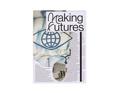
This book documents a two-year action research project accompanying the Bauhaus centenary celebrations. Rather than simply looking back, the project focused...
This book documents a two-year action research project accompanying the Bauhaus centenary celebrations. Rather than simply looking back, the project focused on moving forward and exploring future possibilities. Issues relating to the design of the built environment, i.e. of places where people live alongside each other, were reformulated in an open-minded way as part of a programme combining performance, spatial design, installation, dance and architecture.
The book isn’t just a documentary record however, it’s also a visualisation of that research’s collective dynamic. Even the structure of the contents page is process-based – a hybrid of editorial, abstract and commentary that’s dotted with speech bubbles. Readers then delve into a printed re-enactment of the project.
There is nothing so rigid as a grid system here, at least not one you could accuse of seeking to confine ideas within tables; no sooner than a new design rule has been established, it has to promptly accommodate new ideas on the next spread.
The layout references the old-school technique of paste-up, in which endless strips of paper were cut out and glued to double-page layout boards, moved back and forth, swapped out and corrected before finally being deemed ready for printing. For those with a love of typographical experimentation, the manipulation of these phototypesetting strips was a welcome change from hot metal setting and its cumbersome constraints – though it, in turn, now seems laborious compared to computerised typesetting.
- Publisher:
- ISBN:
- 978-3-95905-625-0
- Author:
- Markus Bader, George Kafka, Rosario Talevi, Tatjana Schneider a. o.
- Pages:
- 196
- Format:
- 24 x 33 cm
- Price:
- € 32.00
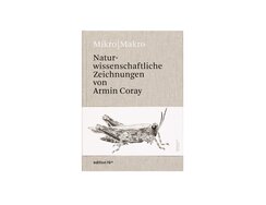
A grasshopper is emblazoned on the belly wrapper, spanning its width. Every detail in this black-and-white illustration is crystal clear,...
A grasshopper is emblazoned on the belly wrapper, spanning its width. Every detail in this black-and-white illustration is crystal clear, from the armour-like carapace to the rows of small ridges on the legs that can only be seen when enlarged to such a degree. The clarity is down to the fact that the drawing consists solely of hard edges, using no semi-tones at all. Here, a digital absoluteness is created entirely by hand, with the illustrator’s pen either making a mark or not.
Those marks are direct translations of Armin Coray’s own observation, the artist having processed each individual part with eyes and mind then reproduced it on paper by hand. For hours on end, Coray studied each insect under the microscope, only drawing lines or dots once he had comprehending of its forms, and only comprehending those forms via the act of drawing them – a quasi self-reinforcing heuristic cycle, the product of which is a morphological scientific illustration.
This book showcases some of those illustrations in exquisite fashion, allowing us to study them in turn. Whole-body drawings are printed on as bright a background as possible, framed by the off-white of the heavy paper. Opposite are full-page enlargements of great graphic sophistication, with stippling used to create a reticulated grain effect here and a diagonal dot row pattern there. It’s almost like perusing Old Master copperplates, such is the virtuosity of these works.
- Publisher:
- ISBN:
- 978-3-00-071846-5
- Author:
- Hans Günter Schmitz
- Pages:
- 64
- Price:
- € 39.00

From the late 1960s, artists, writers and students expressed their demands for social reform via large-scale public protest. It’s against...
From the late 1960s, artists, writers and students expressed their demands for social reform via large-scale public protest. It’s against this backdrop that Edition Nautilus, an independent literary publishing house dedicated to promoting non-conformist and undogmatic left-wing ideas, was launched in 1973. After trawling through the publisher’s archives, co-founder Hanna Mittelstädt has now condensed forty years of correspondence to create this personal history.
That might lead you to expect a design that nods to the iconography of surrealism, anarchism or Dadaism, but not a bit of it. Instead, the cover has a plain background in packing paper brown and is the polar opposite of flamboyant. Similarly, the inside pages get straight down to business and make the most of the space – witness the narrow margins around the type area. The lines of the quoted passages are printed in italics and allowed to spread out across the page. The author’s commentary, on the other hand, is in upright type and indented on both sides. This simple typographical device enlivens the text-only pages, while another subtle tweak serves to further differentiate the two text levels: in the quotes, the first lines of each paragraph are set flush but, in the commentary, they are indented. Even before this, we get a foretaste of the interior’s characteristic understatement: where many books would have both a half-title and a title page, here what looks like a half-title is, in fact, the title page proper.
- Publisher:
- ISBN:
- 978-3-96054-317-6
- Author:
- Hanna Mittelstädt
- Pages:
- 360
- Format:
- 13,7 x 20,7 cm
- Price:
- € 28.00
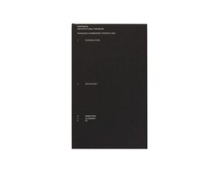
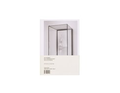
Besides running their own architectural practice, François Charbonnet and Patrick Heiz also work as university lecturers. This weighty tome presents...
Besides running their own architectural practice, François Charbonnet and Patrick Heiz also work as university lecturers. This weighty tome presents student work from their taught programmes in a plethora of fantastical and labyrinthine collages. In one example, a photograph shows a central perspective of the barrel-vaulted St Peter’s Basilica in Rome, the largest church in the world; via just a few additions, the basilica has been transformed into an airport departure lounge, billboards and neon signs complementing the baroque interior in surprisingly plausible yet somewhat disturbing fashion.
A clear-film dust jacket bears soberly arranged white title lines. Beneath it are thick black cover boards that lend the book a stable feel, while the jacket’s transparent spine lays bare the functional and structural core of the book – the blank folded edges of its quires. This visual clarity continues in the book’s interior. Anthological texts, printed in two different kinds of type area, structure the chapters. Some are literary texts in large type that either use the full height of the page or span double-page picture spreads; others are set in compact columns echoing the typical proportions of a reading book and surrounded by generous white space. Here, the grey value is matched by that of the intricate plans and elevation drawings. These, too, offer up surprises: in the street plan accompanying the aforementioned Roman basilica, for instance, we find a runway has been inserted into the Vatican gardens.
- Publisher:
- ISBN:
- 978-3-03860-309-2
- Author:
- Francois Charbonnet, Patrick Heiz
- Pages:
- 656
- Format:
- 18 x 30 cm
- Price:
- € 97.00
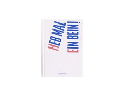
The words are in dark-blue sans serif block letters, semi-bold extra-condensed, their shanks occasionally set at fetching angles so that...
The words are in dark-blue sans serif block letters, semi-bold extra-condensed, their shanks occasionally set at fetching angles so that they seem to be doing a rudimentary dance along the baseline. The pictures are formed of basic red pictograms comprising five squares and a circle. On each left-hand page is a written exhortation; on the facing page, the pictogram offers a suitable action and/or riposte.
What is the meaning of all this? As the authors say on the back cover: “The answer is quite simple.” But that’s easy for them to say.
The key development comes on pages 20 and 21. Here, at last, we get some action: the pictogram figure explodes into pieces (although you could say it was already in pieces). That those pieces only gain meaning through their specific configuration is something any child instantly understands. The reader thus instinctively knows that the figure is in a bad way – a very bad way. And that restoring it to health doesn’t just mean returning those pieces to some kind of systematic order but recreating the figure itself.
This book encapsulates the boundless expressive possibilities of visual imagination. Children might have an uncorrupted relationship to symbols and meaning, but adults are more likely to lean on the semiotic rules of symbol deconstruction. Or perhaps on Kandinsky’s Bauhaus Book No. 9: Point and Line to Plane. Or on Magritte’s pipe that isn’t.
- Publisher:
- Topic:
- Children’s/young adult book
- ISBN:
- 978-3-946896-62-3
- Author:
- Britt Müller; Winnes Rademächers
- Pages:
- 32
- Format:
- 16,5 x 23 cm
- Price:
- € 18.00
At night the demons come. They worm their way into the author’s thoughts, bringing him down and robbing him of...
At night the demons come. They worm their way into the author’s thoughts, bringing him down and robbing him of sleep. Night after night, he makes a note of particular phrases; these he numbers and eventually publishes in book form. The volume’s cover is devoid of any conventional artwork; instead there is just a full-page disclaimer or warning, which starts with the words “Ein gefährliches Buch” (“A dangerous book”).
Mysteriously, the inside pages each feature just a number on the left and a single sentence on the right: opposite the number 35, for instance, we find the comment: “Überschätzen, was ein Spiegel dir zeigt” (“Overestimating what you see in the mirror”). No sugar-coating here, just documentation, enumeration and publication – that’s the author’s formula for countering self-destructive, negative patterns of thinking.
The book design surrounds the text in a visual metaphor: both the page block’s paper and the cover’s cardstock are entirely in Sulphur Yellow Caribic, a physical manifestation of the sulphurous smoke traditionally associated with damnation. The text is entirely typewritten and all the same size, which gives it the feel of an old-fashioned manuscript. You can see how the typewriter’s typebars have practically hammered the negativity and anguish into the paper. The lettering is emphatic, and words sometimes break rank to stand alone amidst the pages’ blank spaces, allowing thoughts to form poetically sculpted matter. This then, is less a handbook and more an invitation to understand the mind’s idiosyncrasies, or perhaps prophylactic medicine for self-destructive tendencies.
- Publisher:
- ISBN:
- 978-3-87439-963-0
- Author:
- Frank Berzbach, Jenna Gesse
- Pages:
- 232
- Format:
- 12 x 21 cm
- Price:
- € 22.00
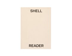
Several tonnes of shell fragments cover the floor of Swedish sculptor Nina Canell’s installation. Every step across the walled-in space...
Several tonnes of shell fragments cover the floor of Swedish sculptor Nina Canell’s installation. Every step across the walled-in space produces an audible crunch; multiple steps combine to create a rushing sound.
Shell Reader is a companion piece to that installation. The book’s heavy paper makes for a weighty page block, though what’s most striking here is the multitude of deep scratch marks scarring all three sides. The edges of the block have been roughly milled, while smooth mother-of-pearl shimmers from inside the hard cover. An allegorical juxtaposition of rough and smooth thus surrounds the book’s interior, within which we find close-ups of some 300 shell fragments, presented as full-page portraits. We study these fragmented exoskeletons, remains of the self-grown shelters of individual marine molluscs, as though they were ancient artefacts.
Despite their vast number, the shell fragments on the gallery floor are just a tiny fraction of the countless shells it took to form all the limestone humans have quarried and ground and used to make concrete, ever since the Romans began turning it into monumental edifices some 2,000 years ago. Much like today’s synthetic plastics, it is an abstract, preternatural material.
But back to the installation: the inserted walls are supported by props reminiscent of those used for a building site’s shuttering. Visitors walk not on cement but on one of its constituents, their footsteps merging to create an archaic, funereal soundtrack. For Nina Canell, it’s all about the physical connection – about broken bodies holding up our own.
- Publisher:
- ISBN:
- 978-3-96436-057-1
- Author:
- Nina Canell, Giulia Rispoli, Sally O'Reilly
- Pages:
- 368
- Format:
- 22,4 x 30,5 cm
- Price:
- € 56.00
A French film about African art in museums, the 1953 documentary Les statues meurent aussi (“Statues Also Die”) could initially only...
A French film about African art in museums, the 1953 documentary Les statues meurent aussi (“Statues Also Die”) could initially only be screened in expurgated form, owing to its implicit criticism of enduring colonial mindsets, with the full-length version not seen until 1968.
Jan Mammey and Falk Messerschmidt took inspiration from that film, seeking out traces of France’s colonial past in Paris’s squares, parks, museums, libraries, churches and on the walls of its buildings.
The 31 sites the photographers identified are recorded in a schematic map on the front inside cover, which also serves as a table of contents. A photo series at the beginning of the book, before we even get to the title page, functions as a kind of extended frontispiece, offering us a foretaste of this city tour.
One mysterious double-page spread presents a group statue enveloped by the impenetrable darkness of night. The chosen perspective results in a pyramidal composition, the photograph focusing on the ambivalent poses of the bronze figures: as though in rebellion at this trophy existence, they are sprawled lethargically on the plinth, concealing from view the military hero atop the monument.
These photographic transformations draw in the viewer’s gaze. Together, they develop a narrative that addresses the casual acceptance of colonial iconography as a feature of everyday Parisian life.
- Publisher:
- ISBN:
- 978-3-03747-108-1
- Author:
- Jan Mammey, Falk Messerschmidt
- Pages:
- 276
- Format:
- 16,5 x 22,5 cm
- Price:
- € 25.00
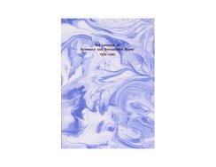
This correspondence between two sisters – one a sculptor, the other a poet, both notable figures in the cultural scene...
This correspondence between two sisters – one a sculptor, the other a poet, both notable figures in the cultural scene of 1970s New York – was published to coincide with a retrospective of Rosemary Mayer’s diaphanous textile works.
It is presented here in the form of a dust-jacketed soft-cover book. The spine-taped book block has been cased in and glued at the spine’s edges to create a hollow back for optimum ease of opening, then wrapped in a jacket that’s attached only to the inner cover’s spine. The outer panels and flaps feature swirling patterns of ink-blue pigment mixed with water; over these are printed understated title lines in typewriter font. Their dark red lettering is foil stamped, creating a light impression reminiscent of genuine typewriting, and seems to be surrounded with very fine edges of light and shadow. Accompanying texts such as introductions, footnotes and the appendix also use this typewriter font. For the correspondence itself, two similar roman typefaces were chosen – a slightly old-style roman for Bernadette and a somewhat more modern style for Rosemary.
The swirling cover motif recurs on the chapter dividers, which are of a slightly thicker weight than the light book paper and have been individually glued in between the stitched quires. This results in a pleasingly tactile effect: run your thumb over the splayed foredge and you find it naturally pausing at each new chapter.
Publishers: Lenbachhaus, Ludwigforum, Spike Island, Swiss Institute.
- Publisher:
- ISBN:
- 978-0-9995059-6-0
- Author:
- Rosemary Mayer, Bernadette Mayer
- Pages:
- 376
- Format:
- 14 x 21 cm
- Price:
- € 24.00
A call to contribute to a state’s planning, labour and government might put you in mind of democratic, civil society...
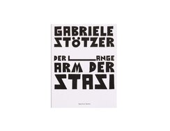
A call to contribute to a state’s planning, labour and government might put you in mind of democratic, civil society participation, but, in fact, “plane mit, arbeite mit, regiere mit” was one of the mottos of East Germany’s Communist regime. This exhortation to participate was one artist Gabriele Stötzer took to heart – so much so that she got herself jailed for the crime of insulting the state.
In poetic single-page biographies featuring personal snapshots, Stötzer presents 32 different artists from the underground scene in GDR-era Erfurt. With their system of structuring lines, which serves as the design template throughout, they look rather like official profiles, a resemblance that’s entirely intentional. Having conducted her own research in the Stasi archive, the author outlines who was being harassed, who was recruited – willingly or under coercion – as informants and who was under close observation. In the GDR, you could find yourself subject to the titular long arm of the Stasi simply for wearing home-sewn punk clothing, or for being a man with long hair. Artist Matthias Büchner, for instance, was being watched by some 100 informants.
The headings are printed in striking block capitals that were drawn with a thick pen, then digitised for computer typesetting. They offer various associations, calling to mind both the expressivity of modern woodcutting, a tradition that survived in the GDR and remains influential today, and the hand-lettered typography of subversive flyers. The aggressive S, meanwhile, mirrors the zigzagging Z.
A powerful antidote to “ostalgia”, the nostalgia for the East German past.
- Publisher:
- ISBN:
- 978-3-95905-317-4
- Author:
- Gabriele Stötzer, Anne König
- Pages:
- 288
- Format:
- 21 x 26,5 cm
- Price:
- € 30.00

Most of Europe’s housing was built in the 30 years following World War Two. A key role in that process...
Most of Europe’s housing was built in the 30 years following World War Two. A key role in that process of renewal was played by modern urban planning concepts inspired by the pioneering but underexploited ideas of the interwar era. This study shows how ambitious new apartment block schemes were developed across Europe.
The book comes wrapped in a loose cloth-bound jacket, the front of which is in black and white. Inside, however, are pastel-hued flaps and panels, a nod to the cheery colours that characterised the 1950s. The page design is based on two different grid variants, one with six and one with four columns. Technical project details are spread across the six-column pages, which allow for varying image widths. The four-column variant is used to structure the essays, though here too images can be accommodated with the columns. The extra-wide paragraph indents, meanwhile, take their cue from the six-column widths, creating appealing typographical cross-references.
The large format of this almost 400-page volume is less about showcasing full-page architectural photographs, though these are also present. Above all, it enables photos both historical and contemporary to be juxtaposed with original plans. In addition, the authors have eschewed the usual laconic or epigrammatic captions; instead, images set within the type area are accompanied by detailed commentaries that are aligned with the introductory text. These can be read as a continuation of the latter and a deeper dive into the subject. Text and design in perfect harmony.
- Publisher:
- Topic:
- Non-fiction
- ISBN:
- 978-3-03863-038-8
- Author:
- Elli Mosayebi, Michael Kraus
- Pages:
- 396
- Format:
- 22 x 31 cm
- Price:
- € 89.00